Final Data
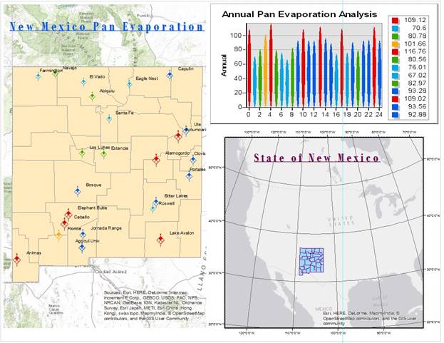
In this assignment, the New Mexico Pan Evaporation was analyzed and presented using the ArcGIS application. In order to complete this assignment, I had to become familiar with the ArcMap Environment and its various tools. The following figures show and explain some of the key steps and challenges in this assignment:
Creating a New Map
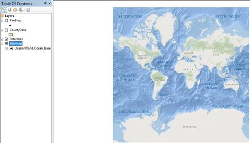
Using the Add Base-map a collection of World maps are presented as in the figure above (world ocean map). This would be the background layer before the remaining data is added.
It is very important to add the file on a USB key to save your initial blank page. From now on, all the changes are applied to this copy and further changes from other devices could be made.
Adding Data
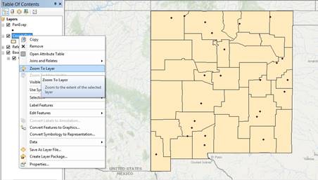
In order to add data, specific files had to be downloaded in the same location as the homework file. The PanEvap and CountyData, in this case were added as shown in the figure above.
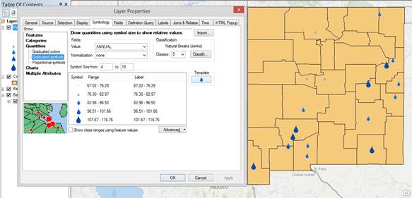
Editing Symbols
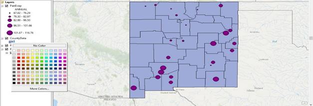
This step of the homework is more about aesthetics and visual aspects of the project. Some of these editing tools are:
- The Data-point Color / Size / Symbols
- Changing Background Color / Transparency
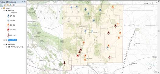
For this assignment, I used the “evaporation” symbol while showing the values in an ascending order by size and color. The figure above shows a more advanced presentation of the data.
The figure above depicts some other visual changes learned on this assignment. (ArcGIS - Chapter 7)
Labels and
Statistics
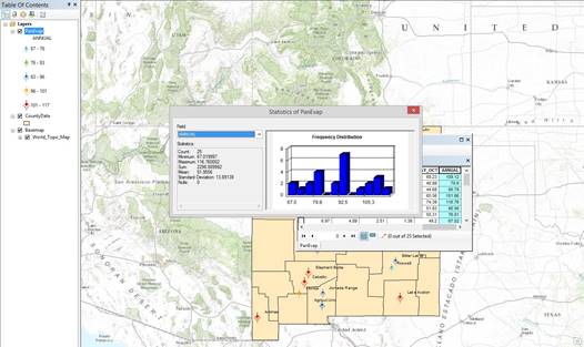
The labels shown in the figure above were applied from the Layer Properties tab. To access the statistics window, the “attribute table” is necessary. By right clicking on the Annual tab, the statistics tool could be used as well calculating the geometry of a data.
As an additional step, with the help of our TA, Natalia, I learned to edit titles in order to create a more appealing map by shortening some of the station names as well as rearranging their placement on the map.