CE547 Index > Pan Evaporation in New Mexico
Steps:
- Files downloaded using Filezilla FTP program.
- Open ArcMap, Add new layers.
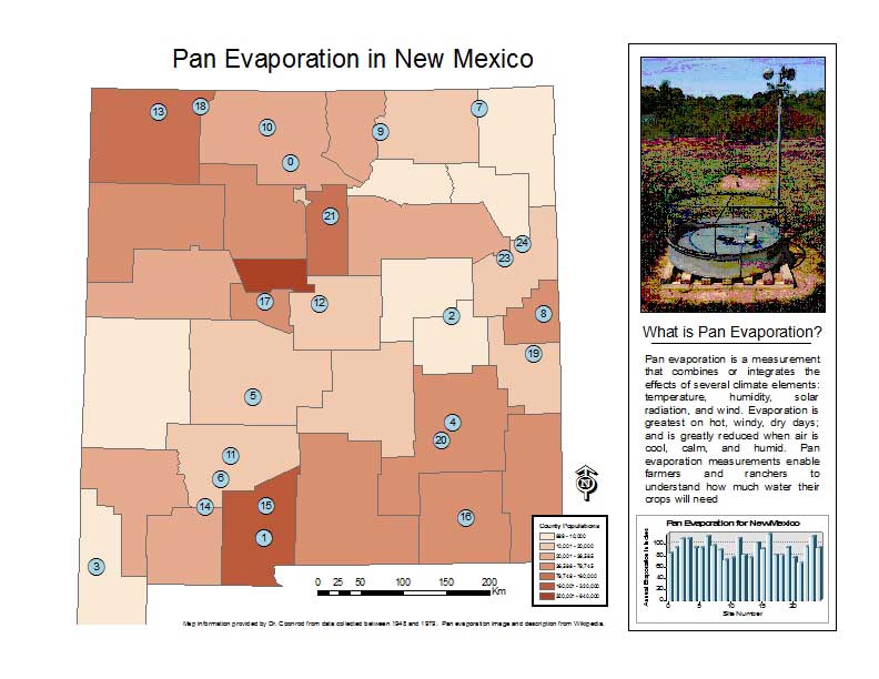
- In New Mexico counties layer, changed symbology to reflect population differences.
- In New Mexico Evap layer, changed symbology to show site number for reference to chart.
- Adding chart: went to Tools>Graphs>Create to make a new graph. Selected the layer to represent, labeled the graph and axes. Finally, right clicked on the graph and added it to layout.
- In layout I added key components: north arrow, legend, scale, etc. Finally positioned components and added descriptive photo and supplemental text.
Issues:
The only problem I encountered was maintaining high resolution of the chart when exporting to PDF. Unfortunately, I was unable to correct this problem. Click on image below to view PDF.