Click here to
Return to the
Art Group Home
Page
Betsy Greenlee
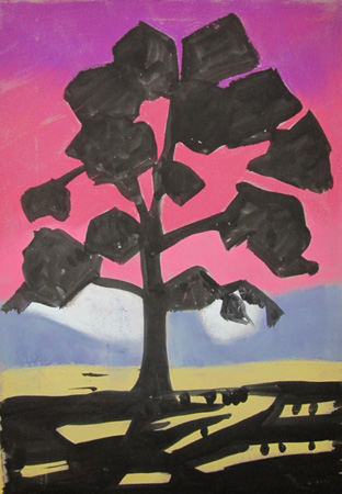
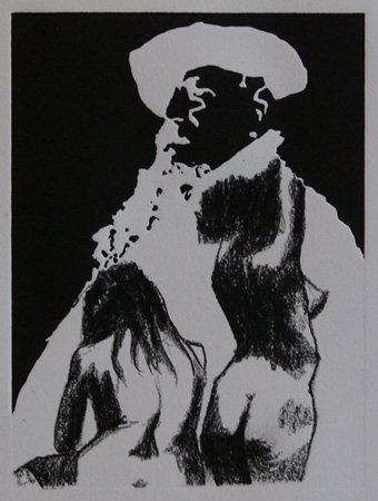
"My understanding of the project was that we were to develop images
that gave equal importance to the negative space. The images I brought
were solarplate prints made this year from photos taken with a pinhole
camera during an eclipse 15 or more years ago. Because the positive
shapes are in silhouette, almost by definition the negative areas are
more interesting.
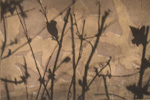
 Eclipse 1 is a plate printed on Rives BFK. The interest in the
background comes almost entirely from the shapes created by the branches
of the silhouetted bush. Eclipse 1 is a plate printed on Rives BFK. The interest in the
background comes almost entirely from the shapes created by the branches
of the silhouetted bush.
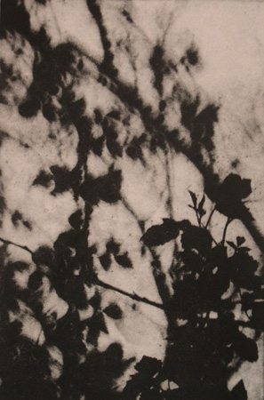
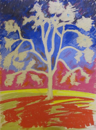
In
 Eclipse 2 I decided to print the image on a
piece of wrapping paper which was simultaneously glued to the BFK
support paper (a process called chine colle'). Eclipse 2 I decided to print the image on a
piece of wrapping paper which was simultaneously glued to the BFK
support paper (a process called chine colle').
I felt the visual texture
on the wrapping paper would add interest to the negative areas.
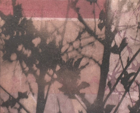
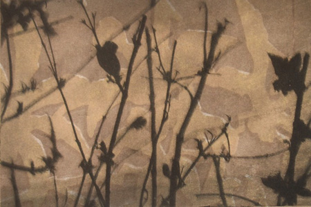
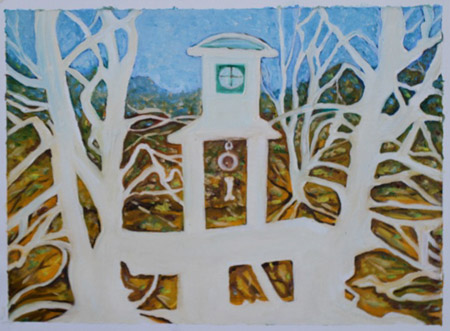
Eclipse
3 also uses chine colle', but instead of an overall pattern I chose an
area of the wrapping paper that was organized geometrically with the
idea that, in addition to adding textural interest to the negative
areas, it would suggest some spatial complexity as well. (Incidentally,
there was a problem with the exposure of this plate, resulting in areas
that did not bite well and therefore did not print intensely black; but
for the purposes of this project, I decided I liked that effect. If the
image had printed uniformly, the positive areas might have been so
dominant that the more subtle effects in the background would have been
lost.)"
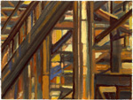
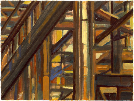
Jeff
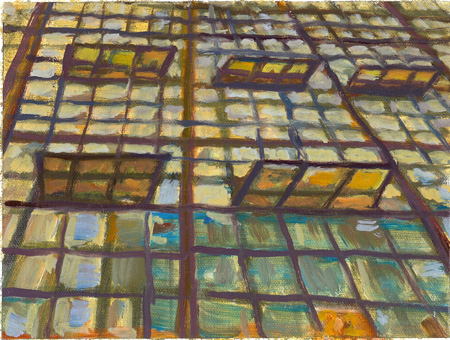
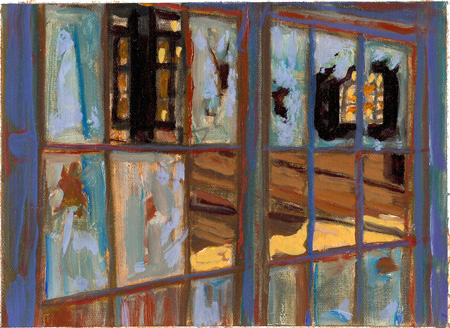
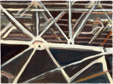
Potter "Using a series of photos I was fortunate to
take at the future WHEELS Museum south of downtown Albuquerque - I
pursued "negative space" behind broken windows, structural beams, etc.
in the old Locomotive repair shop for the BNSF railyard. These are
all oil on linen and each painting is about 5.5" x 7.5" in
dimension"
 "Upward Windows"
"Inward Windows"
 "Upward Lattice"
"Inward Lattice"
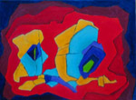
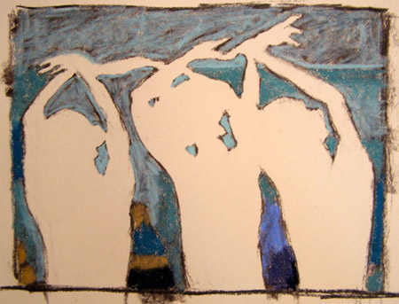
Rod
Groves "The first painting of the
Kachina doll was an effort to let the negative space define the
painting.
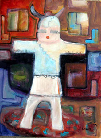
 In
the second painting, "Negative, Positive", I first proceeded in the same
manner but then after our discussion of foreground, middle ground,
background, I sought to develop the positive abstract areas to play with
the distance dimension." In
the second painting, "Negative, Positive", I first proceeded in the same
manner but then after our discussion of foreground, middle ground,
background, I sought to develop the positive abstract areas to play with
the distance dimension."
Leila Hall
""

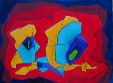
Elaine Scott
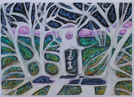
"I
started out by drawing the positive images from a photo and then filling
in the negative space. Oil on linen pad
 Next I painted the negative spaces using
oil pastel on 9"X12" translucent Yupo paper. Next I painted the negative spaces using
oil pastel on 9"X12" translucent Yupo paper.
Once I did the negative
spaces I used red in the positive spaces.
This was done with oil pastel on 9X12''
translucent Yupo paper 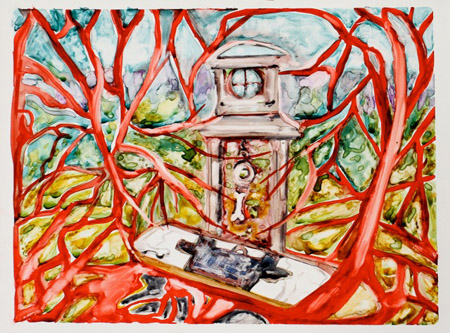
 I then used oil pastels on
9X12" translucent Yupo by painting in the negative spaces." I then used oil pastels on
9X12" translucent Yupo by painting in the negative spaces."
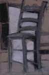
Jaci Fischer
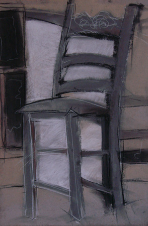 "Chair" pastel "Chair" pastel
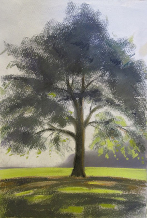
Fred Yost
"Carretta"
charcoal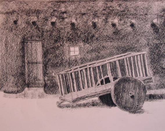
"Rodin" solarprint + charcoal
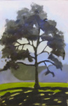
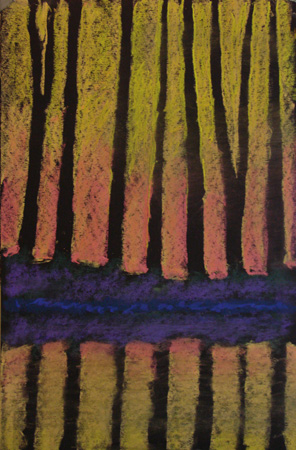 "Trees"
pastel "Trees"
pastel
Gaye
Garrison "The concept of
'negative space' was introduced to me in college. This exercise was done
using a photograph that appeared in our local paper several years back.
The action of the dancers (even though they were standing still)
captured me. In doing the negative space project, I discovered some
interesting things going on in the background: colors, shapes,
variations. Don't know if I actually captured the concept, but my 5 year
old granddaughter knew exactly what the open shapes represented:
'ballerinas!' That, to me, is a sign of success."
Next meeting is Sunday, January 9 at
1 PM.
Project -
Opposite Handed Painting with large brush only
Return to Art Group Home
Page
|