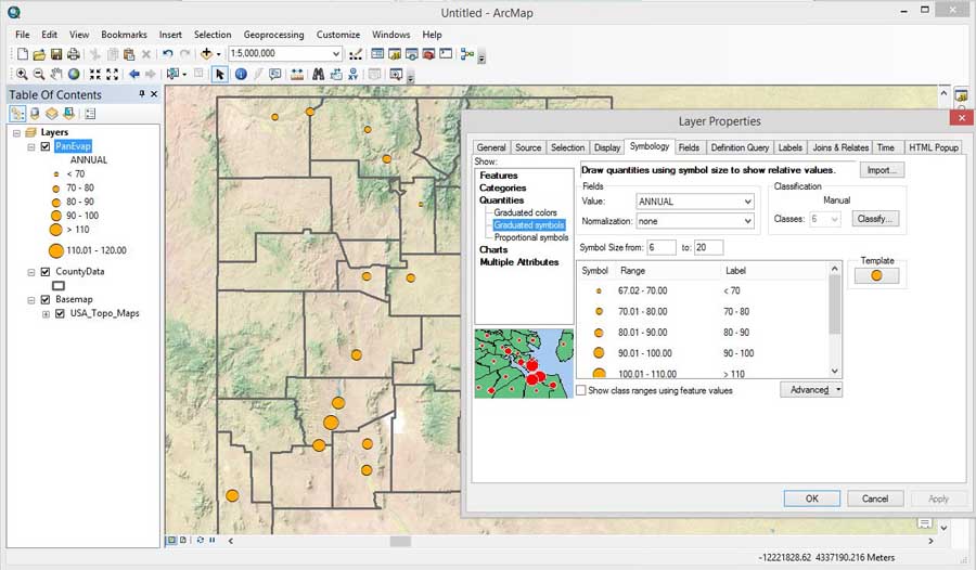
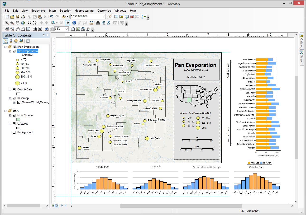
Creating a set of graduated symbols for the PanEvap data. 6 classes, 10 inches apart for ease of viewing. Sizes from 10 pts to 20 pts to give distinction while retaining similar ratios between values.
|
Creating a set of graduated symbols for the PanEvap data. 6 classes, 10 inches apart for ease of viewing. Sizes from 10 pts to 20 pts to give distinction while retaining similar ratios between values. |
|
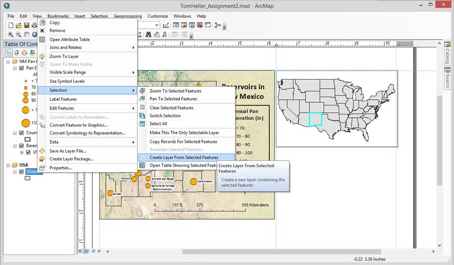
Creating an Area of Extent map. After creating a new Data Frame, I used a shapefile of the US States from the greenbook excercise data, then selected New Mexico from the attribute table, then created a new layer based on the selection. From there I can highlight the shape of New Mexico as desired. |
|
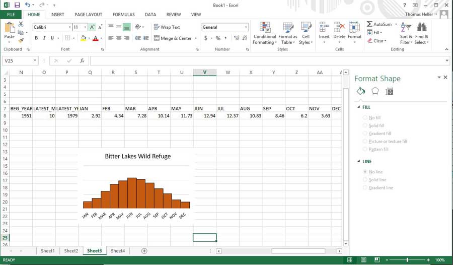
Importing a specific site's data into Excel to create a histogram of monthly evaporation. I could not figure out how to do this in ArcMap, as the data wasn't tabulated in the right way to accomplish this. I'm sure there's a way I can do this all in ArcMap? |
|
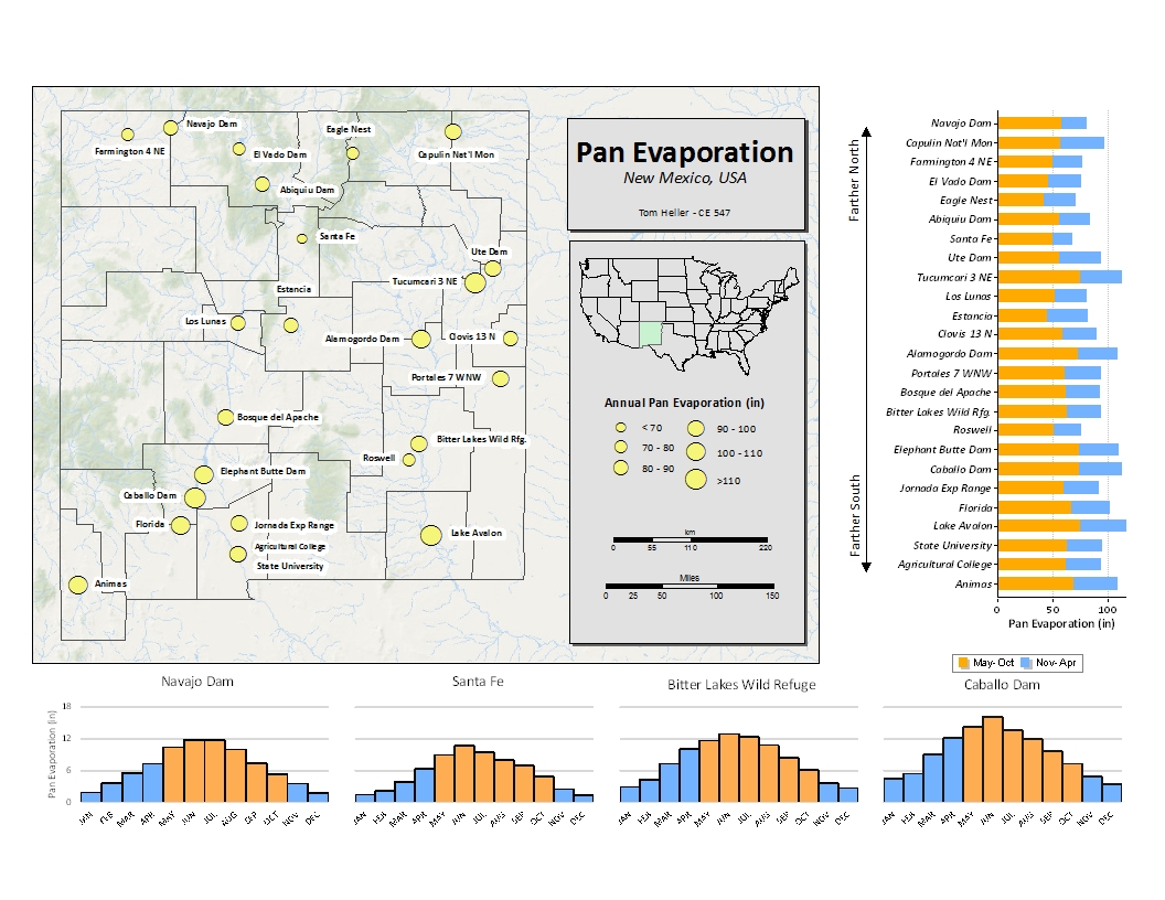
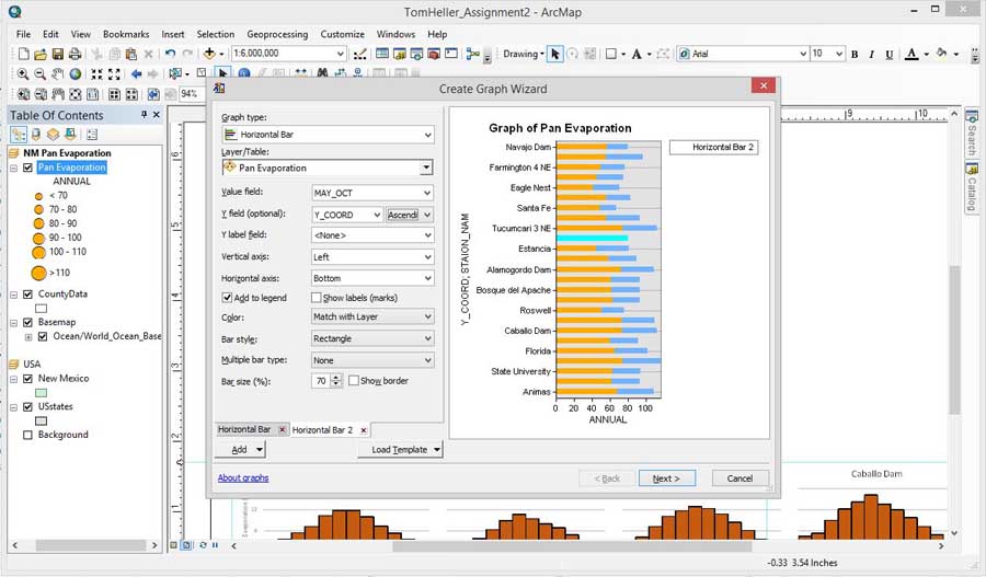
Creating another graph within ArcMap. A horizontal bar graph that shows both summer and winter evaporation totals, and the entries are ordered by relative latitude, to visually show north-south trends. |
|
Using tools on the layout view to alter and arrange objects. The color scheme was also changed to be less confusing and more uniform. The Draw toolbar was used to create text and visual aides, the Advanced Properties of the graph was used to change the appearance of the bar graph. |